Implementation notes
Update: 03/31/2023 - Updated the slider from Slick Slider to Accessible Slick.
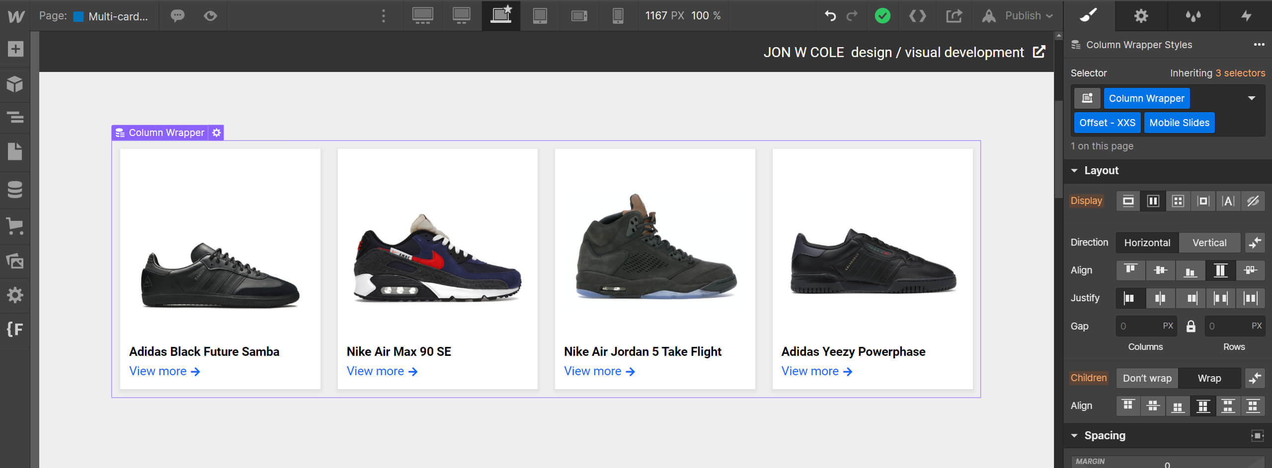
1. Create a group of sibling cards. For this project, we're referencing the 🟦 Products collection.
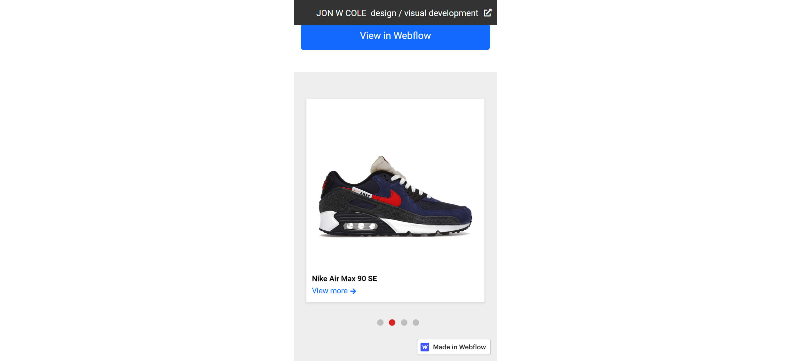
2. Add the class Mobile Slides to the parent div. In this case, that would be the collection list div.
3. Include the Slick Slider CSS file at the end of the Head.
<link rel="stylesheet" type="text/css" href="//cdn.jsdelivr.net/npm/@accessible360/accessible-slick@1.0.1/slick/slick.min.css">
<link rel="stylesheet" type="text/css" href="//cdn.jsdelivr.net/npm/@accessible360/accessible-slick@1.0.1/slick/slick-theme.min.css">
4. Include the custom dot nav styling CSS between <style> tags at the end of the Head.
.slick-dots {
  display: block;
  position: absolute;
  transform: translateX(-50%);
  left: 50%;
  margin: 0;
  bottom: 10px;
  list-style: none;
}
.slick-dots li {
  display: inline-block;
  margin-right: 10px;
}
.slick-dots li button {
  width: 12px;
  height: 12px;
  border: 0;
  border-radius: 100%;
  background-color: rgba(0, 0, 0, 0.2);
  text-indent: -999999px;
}
.slick-dots li.slick-active button {
  background-color: #db2323;
}

@media only screen and (max-width: 767px) {
  .mobile-slides {
  	padding-bottom: 60px;
  }
}
6. Include the Slick Slider script at the end of the Body.
<script type="text/javascript" src="//cdn.jsdelivr.net/npm/@accessible360/accessible-slick@1.0.1/slick/slick.min.js"></script>
7. Include the slider javascript at the end of the Body.
<script id="rendered-js" >
  mobileOnlySlider(".mobile-slides", true, false, 767);

  function mobileOnlySlider($slidername, $dots, $arrows, $breakpoint) {
    var slider = $($slidername);
    var settings = {
      mobileFirst: true,
      dots: $dots,
      arrows: $arrows,
      responsive: [
      {
        breakpoint: $breakpoint,
        settings: "unslick" }] };

    slider.slick(settings);

    $(window).on("resize", function () {
      if ($(window).width() > $breakpoint) {
        return;
      }
      if (!slider.hasClass("slick-initialized")) {
        return slider.slick(settings);
      }
    });
  }
</script>
8. Celebrate at the local watering hole. You are finished.


